Content
11 components
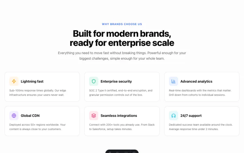
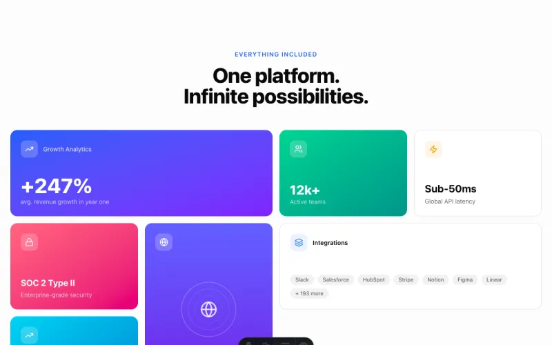


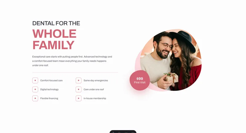
Blob Split (Photo + Icon List)
Two-column band with a blob-masked photograph, an offset backing blob that drifts with the cursor, a corner badge and a two-up icon list. Reversible for zig-zag sections.
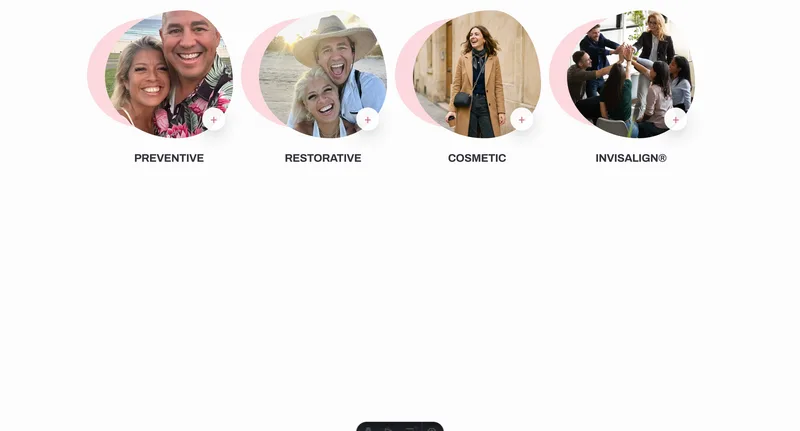
Blob Tiles (Category Strip)
A row of blob-masked photographs, each with an offset backing blob drifting at its own depth and a disc in the corner. Four across on desktop, two on mobile.

Arc Quote (Curved Flood + Testimonial)
Flooded band curving in at the top via a 300vw circle and ending in offset SVG waves, with a cut-out standing on the lower edge and a testimonial alongside.
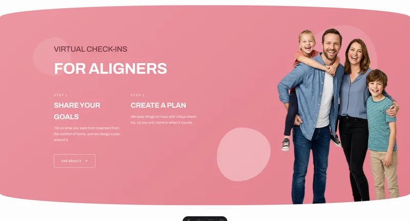
Pill Band (Lozenge Flood + Steps)
A flooded section rounded into a wide lozenge, with a cut-out on its lower edge and either numbered steps or an offer block. Floats free, so it needs no mask or wave.
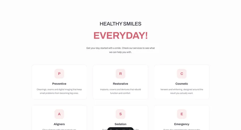
Mono Grid (Monogram Service Cards)
Services grid headed by single letters in rounded tiles rather than icons — no icon library, and it inherits the brand typeface. Server-rendered.